
Note
Go to the end to download the full example code or to run this example in your browser via JupyterLite.
Kendall: the random walk of prices#
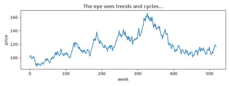
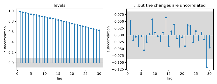
Maurice Kendall (1953) set out to find the cycles in 22 British price series (wheat, cotton, share indices) at weekly intervals. He found none: the serial correlations of the price changes were indistinguishable from zero, and “the series looks like a wandering one, almost as if once a week the Demon of Chance drew a random number”. The levels, by contrast, are almost perfectly autocorrelated, which is what makes them look patterned to the eye.
import matplotlib.pyplot as plt
import numpy as np

from financialkit.time_series import autocorrelation, bartlett_band
from financialkit.time_series.visualizers import plot_acf
A weekly price series#
Ten years of weekly log price changes with a 2% weekly volatility.
rng = np.random.default_rng(1953)
changes = 0.02 * rng.standard_normal(520)
log_price = np.log(100.0) + np.cumsum(changes)

fig, ax = plt.subplots(figsize=(8, 3))
ax.plot(np.exp(log_price))
ax.set_xlabel("week")
ax.set_ylabel("price")
ax.set_title("The eye sees trends and cycles...")
fig.tight_layout()
Serial correlations of levels and changes#
Every autocorrelation of the changes sits inside the 95% band \(\pm 1.96/\sqrt n\) (or close to it, as one in twenty should not), while the levels decay only slowly from one.
fig, (ax1, ax2) = plt.subplots(1, 2, figsize=(9, 3.5))
plot_acf(log_price, 30, ax=ax1)
ax1.set_title("levels")
plot_acf(changes, 30, ax=ax2)
ax2.set_title("...but the changes are uncorrelated")
fig.tight_layout()

rho = autocorrelation(changes, 30)[1:]
print(f"band: +/-{bartlett_band(changes.size):.3f}; lags outside it: {np.sum(np.abs(rho) > bartlett_band(changes.size))} of 30")
plt.show()
band: +/-0.086; lags outside it: 1 of 30
Total running time of the script: (0 minutes 0.554 seconds)
